Evaluating feedback
We all know the score: you attend a conference, business event, or training workshop, and at the end of the day you get a little form asking you to evaluate your experience. You can rate the speakers, venue, lunch and parking

We all know the score: you attend a conference, business event, or training workshop, and at the end of the day you get a little form asking you to evaluate your experience. You can rate the speakers, venue, lunch and parking on a scale from one-to-five, and tick to say whether you would recommend the event to a friend or colleague.
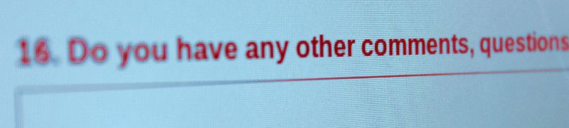
But what about the other part of the evaluation: the open comments box? What was your favourite part of the day? What could we improve for next time? Any other comments? Hopefully someone is going to spend time typing up all these comments, and see if there are some common themes or good suggestions they can use to improve the event next year. Even if you are using a nifty on-line survey system like SurveyMonkey, does someone read and act on the suggestions you spent all that time writing?
And what about feedback on a product, or on service in a hotel or restaurant? Does something actually happen to all those comments, or as one conference attendee once suggested to me, do they all end up on the floor?
In fact, this is a common problem in research. Even when written up, reports often just stay on the shelf, and don't have influence on practice or procedure. If you want decision makers to pay attention to participant feedback and evaluations, then you need to present them in a clear and engaging way.
For the numerical or discrete part of surveys, this is not usually too hard. You can put these values in Excel, (or SPSS if you are statistically minded) and explore the data in pivot tables and bar graphs. Then you can see that the happiest attendees were the ones who ranked lunch as excellent, or that 76% of people would recommend the day to others.
Simple statistics and visualisations like this are a standard part of our language: we hear and see them in the news, at board meetings, even in football league tables. They communicate clearly and quickly.
But what about those written comments? In Excel you can't really see all the comments made by people who ranked the conference poorly, or see if the same suggestions are being made about workshop themes for next year.
That's what Quirkos aims to do: become the 'Excel of text'. It's software that everyone can use to explore, summarise and present text data in an intuitive way.
If you put all of your conference evaluations or customer feedback in Quirkos, you can quickly see all the comments made by people who didn't like your product. Or everything that women from the ages of 24-35 said about your service compared with men from 45-64. By combining the numerical, discrete and text data, you have the power to explore the relationships between themes and the differences between respondees. Then you can share these findings as graphs, bubble maps or just the quotes themselves: quick and easy to understand.
This unlocks the power of comments from all your customers, because Quirkos allows you to see why they liked a particular product. And it gives you the chance to be a better listener: if your consumers have an idea for improving your product, you can make it pop out as clear as day.
Hopefully it also breaks a vicious circle: people don't bother leaving comments as they assume they are aren't being read, and thus organisers stop asking for comments, because those sections are ignored or give generic responses.
So hopefully next time you fill out a customer feedback form or event evaluation, your comments will lead to direct improvements, rather than just being lost in translation.