Freeing qualitative analysis from spreadsheet interfaces
The old mantra is that a picture tells a thousand words. You’ve probably seen Hans Rosling’s talks on visualising quantitative data, or maybe even read some of Edward Tufte’s books on data visualisation

The old mantra is that a picture tells a thousand words. You’ve probably seen Hans Rosling’s talks on visualising quantitative data, or maybe even read some of Edward Tufte’s books on data visualisation. The thrust of the argument is clear: “Good displays of data help to reveal knowledge relevant to understanding mechanism, process and dynamics, cause and effect.” (Tufte 1997).
This chapter also describes the dangers of obscuring data in large amounts of text. He provides examples of the reports that were used to decide to launch the Space Shuttle Challenger on a morning that dipped below freezing, despite concerns that the rubber O-rings in the rocket booster would not function at this temperature. They failed, leading to the death of the crew.
Tufte produces a graph of temperatures at which the shuttle had been previously launched, visually showing how far below previous experienced temperatures this launch was: a vast improvement over the cold technical language presented to management. This illustrates the challenge in summarising and presenting not just quantitative statistics, but also the qualitative world of meetings, discussion and decision making.
However, why shouldn’t this apply during the analysis of qualitative data? Obviously it does, we can quickly identify visual elements like graphs, and relative size, and so word clouds and graphs are all popular export methods from qualitative software. But that analysis process, not just the end product is a very complicated cognitive process, and where it is important for researchers to see the big picture; to get an overview of how things are emerging. Visual representations here can show the researcher what is emerging from the data, and a birds-eye view of the project. The difficulty is that at the same time, there is a need to drill down, and examine the minutiae of one quote or connection.
So how can we get a graphical approach during the analysis process as well as the reporting and summaries? Generally software packages use a spreadsheet-style interface, where working with qualitative data is restricted to columns and rows, quickly collapsed into quantitative representations and overviews.
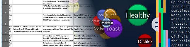
A project like ‘nineteen’ aims to go part way to address this: by making quantitative and qualitative data from spreadsheets more visual. It turns data into more graphical and colourful representations, which help users see patterns and connections in the data.
To a certain extent, this approach can be done in Excel, using Pivot tables and conditional formatting. It can really help tabulated data ‘pop’, and even simple things like colour coding for particular respondents or themes can make it much easier to find quotes and similarities in qualitative data. (Some day, I am going to have to write a blog post on using Excel for qualitative research!). However, this is actually one way in which most qualitative software is inferior to Excel, because it is very difficult to apply any sort of dynamic visualisation or colour to the data while you work with it to illuminate it in different ways.
Quirkos makes not just reports and summaries visual and engaging, but also the analysis interface itself. I think this is vital, because users need to get constant feedback during the analysis process. If a researcher is forced to generate a new graph in a new window to get a project overview, they are taken out of the flow of the process. Results must be live and interactive, and Quirkos aims to provide that as much as possible.
The same goes for search and retrieve, a separated list of results is not illuminating to the researcher, the user is presented with compartmentalised data which begins to lack context. Nearly all the other qualitative software packages have this model: a query is a process, and the results another window of data. In Quirkos, we designed a separate query view that is dynamic and interactive. Results are shown again with colour coded bubbles representing number of hits, and the quotes are integrated into the screen to connect back to the full data source. That way, you get the overview, and the context of the data together. I know that people really love the side-by-side comparison view in this screen too, because again it is about getting that context, and again in a visual way.
All the qualitative analysis software out there will let you generate reports based around graphs and visual methods to communicate qualitative data. However, only Quirkos integrates this into the analytical process, making sure you get constant feedback. For myself, and many other qualitative researchers, this is the most important (and lengthy) part of a project, and ways to help people to spot important findings in the data should be fully integrated into the workflow, not delivered as a side-step.