Word clouds and word frequency analysis for qualitative data
In the latest update for Quirkos, we have added a new and much requested feature, word clouds! I'm sure you've used these pretty tools before, they show a random display of all the words in a source of text

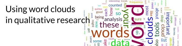
What’s this blog post about? Well, it’s visualised in the word cloud above!
In the latest update for Quirkos, we have added a new and much requested feature, word clouds! I'm sure you've used these pretty tools before; they show a random display of all the words in a source of text, where the size of each word is proportional to the number of times it has been counted in the text. There are several free online tools that will generate word clouds for you, such as WordClouds and WordArt.com.
These visualisations are fun, and can be a quick way to give an overview of what your respondents are talking about. They also can reveal some surprises in the data that prompt further investigation. However, there are also some limitations to tools based on word frequency analysis, and these tend to be the reason that you rarely see word clouds used in academic papers. They are a nice start, but no replacement for good, deep qualitative analysis!
We've put together 7 tips for making sure your word clouds present meaningful information, along with some cautions about how they work and their limitations.
Tip 1: Tweak your word cloud's stop list!
As these tools count every word in the data, results would normally be dominated by basic words that occur most often, 'the', 'of, 'and' and similar small words that are meaningless on their own. To make sure that this doesn't swamp the data, most tools will have a list of 'stop' words which should be ignored when displaying the word cloud. That way, more interesting words should be the largest. However, there is always a great deal of variation in what these common words are. They differ greatly between verbal and written language, for example (just think how often people might say 'like' or 'um' in speech but not in a typed answer). Each language will also need a corresponding stop list!
So Quirkos (and many other tools) offer ways to add or remove words from the stop list when you generate a word cloud. It's best to do this manually yourself, as common words like 'think' and 'she' might be useful to certain projects looking at expressions of opinions or depictions of gender. So it's a good idea to look at the word cloud, and remove words that aren't important to you by adding them to the stop list. Just make sure you record what has been removed for writing up, and what your justification was for excluding it!
Tip 2: Remember there is no word weighting or significance in word clouds.
Since word frequency tools just count the occurrence of each word (one point for each utterance) they really only show one thing: how often a word was said. This sounds obvious, but it doesn't give any indication of how important the use of a word was for each event. So if one person says 'it was a little scary', another says 'it was horrifyingly scary' and another says 'it was not scary', the corresponding word count doesn't have any context or weight. This can look deceptive in like a word cloud, where the above examples count the negative (not scary) and the minor (a little scary) the same way, so 'scary' could look like a significant trend. Remember to always go back and read the data carefully to understand why specific words are being used.
Tip 3: Consider whether derivative words should be grouped together in your word cloud.
Most word cloud tools don't count words, only combinations of letters. So 'fish', 'fishy' and 'fishes' will all get counted as separate words (as will any typos or misspellings). This might not sound important, but if you are trying to draw conclusions just from a word cloud, you could miss the importance of fish to your participants, because the different derivations weren't grouped together. Yet sometimes these distinctions in vocabulary are important – obviously 'fishy' can have a negative connotation in terms of something feeling off, or smelling bad – and you don't want to put this in the same category as things that swim. So a researcher is still needed to craft these visualisations, and make decisions about what should be shown and grouped. Speaking of which...
Tip 4: Check for differences in the terms used by participants, as word clouds won't amalgamate these words together.
It's fascinating how different people have their own terms and language to describe the same thing. Illuminating this can bring colour to qualitative data or show important subtle differences that are important for IPA or discourse analysis. But when doing any kind of word frequency analysis, this richness is a problem, as the words are counted separately. The terms 'shiny', 'bright' or 'blinding' may not show up often, but if grouped together they could show a significant theme. Whether you want to treat certain synonyms in the same way is up to the researcher, but in a word cloud these distinctions can be masked.
Also, don’t forget that unless told otherwise (or sometimes hyphenated), word cloud apps won’t pick up multiple-word phrases like ‘word cloud’ and ‘hot topic’.
Tip 5: Don’t focus on just the large trends in the word cloud.
Word clouds make the big language trends very obvious, but this is usually only part of the story. Words that aren’t there are just as important – things you thought would come up, and topics people might be hesitant to speak about. A series of word clouds can be a good way to show changes in popular themes over time, like what terms are being used in political speeches or in newspaper headlines. In these cases, words dropping out of use are probably just as interesting as the new trends.
Tip 6: Don't try to get qualitative results solely from word clouds.
At best, word clouds are a quantification of qualitative data, presenting only the numerical counts of words. Since word frequency tools are just counting sequences of letters, not even words and their meanings, they are a basic supplemental numerical tool to deep qualitative interpretation (McNaught and Lam 2010). And as with all statistical tools, they are easy to misapply and poorly interpret. You need to know what is being counted, what is being missed by the count (see above), and before drawing any conclusions, make sure you understand the underlying data and how it was collected.
Tip 7: Use word clouds as summaries or discussion pieces, as this is where they work best.
If you need to get across what’s coming out of your research quickly, showing the lexicon of your data in word clouds can be a fun starting point. When they show a clear and surprising trend, the ubiquity and familiarity most audiences have with word clouds make these visualisations engaging and insightful. They should also start triggering questions – why does this word or phrase appear more often than others? These can be good points to start guiding your audience through the story of your data, and creating interesting discussions.
As a final point, word clouds often have a level of authority that you need to be careful about. As the counting of words is seen as non-interpretive and non-subjective, some people may feel they ‘trust’ what is shown by them more than the verbose interpretation of the full rich data. Hopefully with the guidance above, you can persuade your audience that, while colourful, word clouds are only a one-dimensional dive into the data. Knowing your data and reading the nuance will be what separates your analysis from a one-click feature into a well communicated ‘aha’ moment for your field.
If you'd like to play with word clouds, why not start a free trial of Quirkos? It also has raw word frequency data, and an easy-to-use interface to manage, code and explore your qualitative data.